The JavaScript charting landscape is littered with libraries, but many teams choose the wrong one. This is usually a product mismatch rather than an error in developer judgment. The reason? Most libraries are compared as equals in “best-of” roundups. When a team is evaluating charts for their app, they’re faced with a question, not a multiple-choice test. “Which one should I pick from this list?” That’s like asking what’s the best SUV when some teams want a 4×4 and some want a minivan.
Different charting libraries are built for different use cases. Some render millions of real-time data points. Others are designed to drop into a React app. Some are open source. Most comparisons lump all of this into a simple feature list, but real users have different criteria than feature lists.
We’ve reviewed 10 popular charting libraries for performance (rendering speed with large datasets), features (chart type breadth), integration with common frameworks (React/Angular/Vue components), licensing model (open source vs commercial), and developer experience. A few of these are built for real-time, high-performance rendering. They handle 100 million datapoints. Others are focused on ease of integration, composable framework components, or simplicity (no dependencies). Here’s a quick look at how these charting libraries stack up.
Quick Comparison
Scan this table to match your project’s priorities: real-time performance, framework fit, or open-source licensing.
| Firm | Chart Types | Rendering Engine | Best For | Open Source |
| SciChart | 30+ including 3D | GPU-accelerated Vx™ engine | Millions of data points | No |
| Highcharts | Stock, Maps, Gantt, Grid | SVG with Canvas fallback | Production dashboards | No |
| amCharts | 60+ types | Canvas-based rendering | Accessibility and performance | No |
| Fusioncharts | 95+ charts, 1400+ maps | SVG and Canvas hybrid | Complex enterprise dashboards | No |
| ZingChart | 50+ chart modules | Canvas and SVG | Real-time streaming data | No |
| ApexCharts.js | 20+ interactive types | SVG rendering | Multi-framework integration | Yes |
| Recharts | 10+ composable components | SVG via D3 submodules | React-specific projects | Yes |
| Apache ECharts | 20+ including Sankey | Canvas and SVG dual | Large datasets, open community | Yes |
| D3 by Observable | Unlimited custom | DOM, SVG, Canvas bindings | Bespoke interactive graphics | Yes |
| CanvasJS | 30+ including StockChart | HTML5 Canvas | Financial time-series data | No |
Top 10 JavaScript Charting Libraries
Choosing a charting library isn’t easy. Performance, framework compatibility, cost, and learning curve all matter. Here’s a breakdown of the top ten options and where each one excels.
Highcharts — Mission-driven team delivering accessible, production-grade dashboards for real-world apps
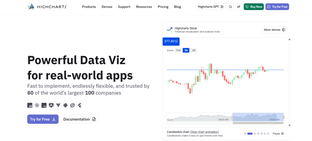
Out of the box, there are 6 specialized modules: Core, Stock, Maps, Gantt, Grid, and Dashboards, which cover all the common charting problems a company has to solve on a day-to-day basis. It integrates with React, Angular, and Vue, so you don’t have to make any drastic architecture changes to your codebase if you already use these frameworks in your project.
Highcharts isn’t meant to handle millions of data points, nor is it designed with a GPU-accelerated backend, but it does have a better focus on things like accessibility and responsiveness than a lot of other charting libraries. It covers all the types of charts you’d expect to see in a business dashboard, like time-series financial charts, geographic data heatmaps, timelines in Gantt charts, and interactive data grids.
For a commercial use license, you get access to enterprise support. It’s especially helpful when you’re releasing customer-facing analytics or even business intelligence dashboards where you can’t afford to have it down even for a day. It’s clear that the developers have been building this software with practical requirements in mind, like ensuring support for things like accessibility, keyboard navigation, cross-browser support, and responsiveness, to name a few, because it’s been deployed into many production environments.
It’s well worth it if you need to deliver reliable and accessible dashboards, as it’s not necessarily going to offer the most optimized rendering.
Highlights
- Six charting modules covering stocks, maps, Gantt, grids, and dashboards
- Ready-made React, Angular, and Vue wrappers
- Accessibility support with WCAG compliance
- Commercial license includes enterprise support
- Intended for business use, not real-time data
SciChart — When you need to render millions of datapoints in real-time without dropping frames, this GPU-accelerated library outperforms everything else
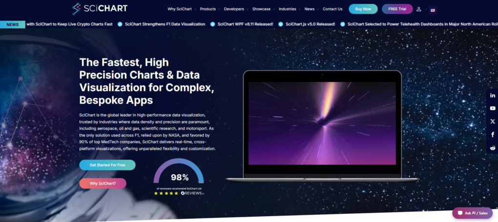
SciChart is the best JavaScript chart library for applications that demand extreme performance and scalability.
Established in 2012, it was built specifically to solve one of the hardest challenges in browser-based data visualization: rendering hundreds of millions of datapoints in real time. Its proprietary Vx™ GPU-accelerated rendering engine leverages WebGL to deliver smooth, responsive charts even when handling large scientific, financial, and industrial datasets.
Beyond performance, SciChart offers one of the most comprehensive feature sets in the market, including 2D and 3D charts, heatmaps, geo maps, gauges, and polar charts. Developers benefit from a highly flexible API with extensive customization options, allowing them to build tailored dashboards and analytics applications.
The platform supports JavaScript, React, WPF, iOS, and Android, making it easier to maintain a consistent user experience across web and native applications. SciChart also has a strong reputation among developers, with nearly 500 five-star Reviews.io reviews, more than 170 examples and demos, comprehensive documentation, and a built-in AI assistant available throughout its documentation.
Highlights
- Vx™ GPU-accelerated WebGL rendering engine
- Renders hundreds of millions of datapoints in real time
- 2D, 3D, Geo Maps, Gauges, Polar Charts, and Heatmaps
- Highly customizable API with extensive developer controls
- More than 170 examples and demos
- Built-in AI documentation assistant
- Nearly 500 five-star Reviews.io reviews
- Cross-platform support for JavaScript, React, WPF, iOS, and Android
- React and Angular wrappers
- Ideal for scientific, financial, industrial, and real-time analytics dashboards
amCharts — Two decades of data-viz refinement delivering 60+ chart types with Canvas-powered rendering that outpaces SVG rivals on large datasets
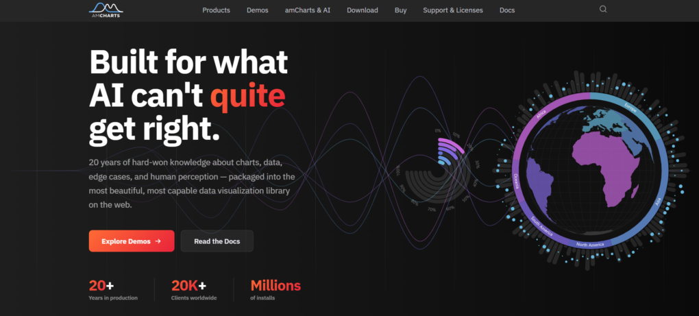
amCharts was established in 2006 and comes equipped with over 20 years of expertise in visualization within the JavaScript market. It features 60+ chart types, from financial candlestick charts to geo maps and Gantt timelines, with a feature set comparable to that of commercial software.
It performs optimally, and its canvas-based rendering engine ensures high performance. In contrast to SVG-based charting libraries, it can process datasets with more than 10,000 points. This makes amCharts ideally suited for real-time dashboarding and analytics applications.
With built-in support for responsiveness and accessibility, amCharts is the de facto standard of 20,000+ companies globally for mission-critical dashboarding, ensuring API stability and compatibility with major browsers. It is easy to use in React, Angular, and Vue, and doesn’t require an extra library or plugin to integrate.
Highlights
- Canvas-based rendering performs better than SVG on datasets with 5,000+ records
- 60+ chart types for financial, geographic, and timeline-based analysis
- Accessibility and ARIA support built-in
- Framework agnostic, making integration seamless with React, Angular, and Vue
- Commercial licensing, with one-time and subscription-based models
Fusioncharts — The breadth champion: 95+ chart types and 1400+ maps for enterprise dashboards that need every visualization under one roof
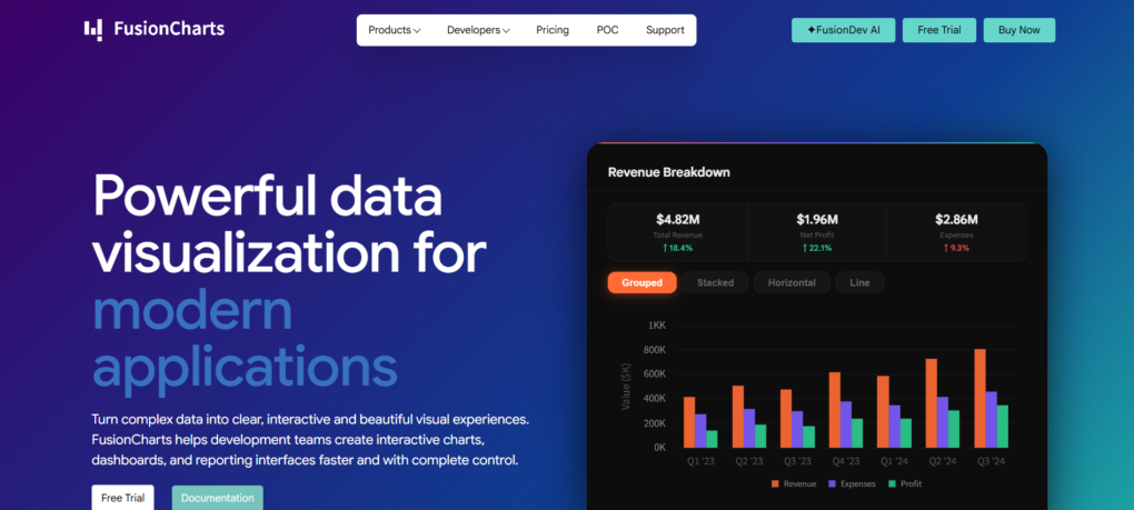
Fusioncharts is ideal for teams creating sophisticated dashboards requiring multiple chart types and performance. This is not another JS charting library. 95+ different chart types, including hierarchical visualizations, Gantt charts, and heat maps, 1400+ geographic maps for financial metrics, regional maps, heat maps, and more, as there is no need to patch together different libraries.
20+ pre-built dashboard templates (sales pipelines, logistics, executive dashboards) provide a faster start. Developers love it for easy integration with React, Angular, and any JavaScript frameworks, and it just works.
Fusioncharts is a JavaScript charting library designed for the web, mobile, and enterprise environments. Use Fusioncharts for web, mobile, enterprise, and all your charting needs.
Highlights
- 95+ different chart types, including Gantt, hierarchical, and heat maps
- 1400+ geographic maps supporting regional map drill-down
- React & Angular wrappers for framework-specific use
- Dashboard templates built for Sales, Logistics, and Executive use
- Use for web, mobile, and enterprise
- single API, with no need to patch together
ZingChart — Dependency-free library with 50+ chart types built for datasets up to 100,000 records
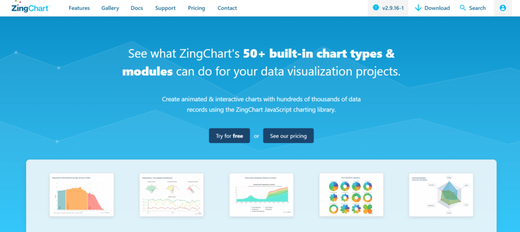
Established in 2009, ZingChart supports more than 50 chart types and visualization modules and does not require any dependencies. ZingChart fills a gap between extremely lightweight alternatives and those with GPU-accelerated rendering, specifically optimized for data sets of up to 10,000 and 100,000, where canvas allows for smooth interaction without WebGL.
ZingChart is good for when real-time matters; if you are making an interactive dashboard with live data, ZingChart is good for it. This makes ZingChart suitable for dashboards with data that is updated every few seconds but does not involve large data volumes of millions of points being displayed simultaneously. ZingChart is standalone and does not need a build process; just include one JavaScript file in your project, and you’re ready to go.
ZingChart scales for mid-range data sets that would slow down SVG-based charting, but are too low volume for using GPU-accelerated solutions. It is good for business intelligence or operational dashboards with frequent updates.
Features include:
- Heatmaps, treemaps, Gantt charts, and other 50+ types
- Real-time data streams with sub-second refresh rates
- Zero dependency: only one JavaScript file required
- Interactive drill-down dashboards with filters and annotations
- Canvas rendering optimized for 10K to 100K data points
ApexCharts.js — Drop-in charting that works across React, Angular, Vue, and Blazor without rewriting your visualization layer
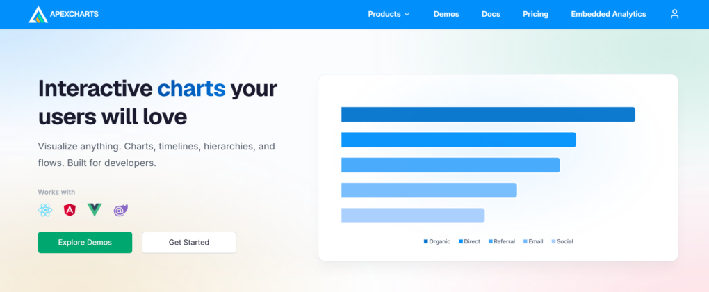
ApexCharts.js was released in 2018 with the idea of being a one-stop, framework-agnostic solution for building dashboard widgets. You don’t have to have separate libraries for each framework (React, Angular, Vue, Blazor), and all chart types with interactivity are built in (tooltips, legends, breakpoints, etc.).
There are 20+ charts, and you can easily make a line chart with five lines of JSON. The core library handles zooming, panning, annotation, and exporting (no third-party plugins needed).
While it might not be optimized for millions of data points streaming in real-time like some GPU-based engines, for a normal dataset with 10,000-50,000 data rows in a single chart, the SVG approach of ApexCharts.js is very performant and works across frameworks.
Recharts — React developers building dashboards get composable chart components that feel like native JSX
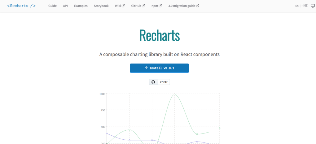
Launched in 2015, Recharts is the first charting library designed to support the component-based nature of React, as opposed to having to add charting to your React app with third-party libraries.
In Recharts, all of the building blocks of a chart (including axes, tooltips, legends, and data points) are themselves components, making them flexible and easy to compose. It uses SVG, which allows for a powerful declarative API. The library is made with some lightweight modules of D3, giving the flexibility of an open-source project, the ease of use of React, and all the benefits of an SVG implementation.
State management, like conditional rendering and updating the state of data, is simple because it is all controlled with props and hooks. It won’t match GPU-accelerated engines for million-point datasets, but for typical dashboard volumes, it’s unbeatable for development velocity. Otherwise, there is a solid set of features that you’ll be able to quickly start using.
Highlights
- Recharts features a composable architecture that consists of multiple components
- It uses SVG to draw charts, but also has support for canvas drawing
- The library consists of components that you can use to create a variety of charts
- It is a completely open-source project with over 300 contributors
- It has built-in TypeScript support for type safety and compatibility with React 18
Apache ECharts — Fully open-source foundation for complex, data-heavy visualizations with zero licensing friction
Launched in 2012 and under Apache Software Foundation stewardship since 2018, ECharts provides more than 20 chart types out of the box, such as Sankey plots, treemaps, and heatmaps, which typically come behind a paywall in proprietary solutions.
You can choose between Canvas or SVG rendering for performance or scalability needs, respectively, while the stream loading mechanism accommodates datasets exceeding the capacity of a single-pass rendering approach and doesn’t hold up the UI thread.
The library has an active open source community that develops accessibility capabilities, localisation, and framework integrations that keep up to date with modern web standards. No vendor lock-in.
The Apache 2.0 license allows you to fork and modify the code as you need, deploy it however you want, and not worry about enterprise licensing deals or seat counts which go up when new developers join a company.
Highlights
- 20+ charts, including special layouts such as Sankey plot, treemap, and parallel coordinates
- Canvas / SVG dual mode plus incremental data load for large amounts of data
- Long-term stability supported by the Apache Software Foundation governance
- Free commercial use with the freedom to modify it as needed
- Accessibility and i18n features included
D3 by Observable — The low-level toolkit for developers who need pixel-perfect control over every visual element
First released in 2011, D3 is still considered the most important visualization library on the JS web. Rather than pre-defined chart libraries, D3 binds data directly to the DOM/SVG/Canvas; you’re not picking a chart to be used from a selection but are essentially building the charts you need from scratch from the ground up. This is obviously much harder work initially, but the result allows you to create visualizations you couldn’t do before with other libraries.
The library is very large, encompassing all the parts needed for visualization, such as scales, animation, layouts, transitions, and interactions; you only need to include the parts you need. It has been used to create many dashboards and custom visuals where the need for control over the exact look and feel of your graphics makes using something else impossible.
Highlights
- Completely open source, modular imports
- Data-driven manipulation of the DOM/SVG/Canvas/HTML
- Transitions, scales, axes, and force layout
- Use by newsrooms all over the world to build custom visuals
Chart.js — Community-driven simplicity for developers who need responsive charts without commercial licensing
Chart.js gets straight to the point by cutting out the usual enterprise features. There’s no complex licensing model or premium tiers to worry about because it’s a completely free, open-source project. A worldwide collective of volunteers maintains Chart.js because they really care about developer experience, not adding lots of unused features.
It provides 8 types of charts with an HTML5 Canvas engine, including:
- bar charts
- line charts
- pie charts
- doughnut charts
- radar charts
- polar area charts
- bubble charts
- scatter charts
It isn’t built for big data sets, real-time streaming, or GPU support; this library was designed for the 80% of use cases where you want to show your data in a SaaS or content website, and you want it to look good, be easy to implement, and not be a struggle to maintain.
Chart.js comes built with a responsive design and advanced animations. It also supports mixed charts (for example, a bar chart with a line chart overlay) and custom scales (such as logarithmic scales), without the need for external plugins.
Because Chart.js uses the Canvas API, the bundle size and performance impact are relatively small and suitable for data sets with fewer than 10,000 data points. If you don’t require any of the features mentioned above, you’re getting production-ready interactivity, no licensing or vendor-lock-in headache.
One-line drawback: No support for financial candlesticks, heatmaps, or map visualisations out of the box (you’d need to write your own, use a third-party plugin, or use a different library).
CanvasJS — Lightweight Canvas rendering for financial dashboards and high-frequency time-series visualization
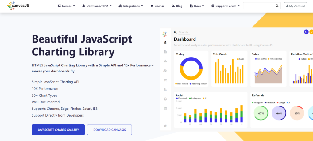
CanvasJS was created in 2013 and offers 30+ types of charts through an HTML5 Canvas-based library, which performs well with large data sets. In comparison to a similar D3 library, CanvasJS is better suited for charting large data sets that cause the performance of SVG-based libraries to slow down.
It’s a dedicated module called StockChart that comes ready for use with no further configuration or coding required. The StockChart module is great for financial data visualization as it has candlesticks, OHLC, range selector, and more. It’s best for time-series data with real-time data update features, such as scrolling, zooming, and panning, that require high performance when plotting multiple data series.
The CanvasJS API has been kept simple to reduce the complexity of using it. Cross-browser compatible and framework compatible mean it runs in any modern browser like Chrome, Firefox, and Edge, and is compatible with any JS framework or vanilla JS. It can also render large data sets very quickly with interactive scrolling, zooming, and crosshairs, making it well-suited for large multi-point, multi-series chart applications and dashboards.
Highlights
- Renders 30+ different chart types using HTML5 Canvas
- Renders data sets with up to 100,000 data points
- StockChart module with Candlestick, OHLC, and Range Selector
- Zero dependencies, compatible with any JS framework and vanilla JS
- Fully interactive features such as zoom, pan, scrolling, crosshairs, exporting and more included
- Adapts to any device or responsive web page
Frequently Asked Questions
Q: How much are JavaScript charting libraries in 2026?
A: Cost ranges from free (open source like Chart.js and Apache ECharts) to $500 to 2,000 per dev seat per year for commercial libraries with GPU acceleration and enterprise support. Most commercial offerings have tiered licensing: a single developer license starts at around $300 to 600/year, and team or site licenses cost extra depending on the number of users/deployments. For example, a few vendors have packages that include multiple chart types (stocks, maps, Gantt, etc.) that run $1,500 to 3,000/year.
Q: Can I use open source charting libraries in commercial software?
A: Yes, if the license allows it. MIT and Apache 2.0 licensed charting libraries (e.g., Chart.js, Apache ECharts, D3) can be freely used in commercial software without paying royalties. Other charting libraries are dual licensed; you can use the library for free in open source or non-commercial projects, but if you build a revenue-producing application, you will have to purchase a commercial license. Read the license in the source repository before you use the library.
Q: Can I use the same chart library in React, Angular, and Vue?
A: Most modern charting libraries come with official wrappers or components for React, Angular, and Vue, but framework-agnostic libraries can be used with vanilla JavaScript and integrate into any framework via a component’s standard lifecycle hooks. Note that a few charting libraries are designed for React alone and are not intended to be used with other JavaScript frameworks (at least not without writing a wrapper adapter).
Q: How many data points does it take for a JavaScript chart in the browser to perform poorly?
A: Canvas-based libraries can draw 10,000 to 100,000 points with no noticeable impact on frame rate on average hardware these days, and the GPU-accelerated ones push that up to 1M points at 60FPS. SVG-based libraries start to lag significantly at the 5,000 to 10,000 point range.
Methodology
To assess all libraries in this ranking, we evaluated each JavaScript charting library on five specific criteria: real-time performance, available chart types, ease of integration with popular frameworks, licensing costs, and user-friendliness.
Information for this article was gathered directly from each library’s profile, specifically its positioning, available features, year founded, and pricing. We also referenced the performance data each library provided in publicly available benchmark tests.
Furthermore, we considered each library’s performance as one of the best charting libraries, whether it focuses specifically on real-time or is better suited for frameworks. To compile the ranking, we compared each JavaScript charting library’s performance across those areas. All library ratings are based on technical analysis and research on library documentation and capabilities, not on any paid promotion by each vendor.
The aim of this ranking is to help developers find a JavaScript charting library that best meets their needs, and specifically, which one offers performance advantages and real-time capabilities over other libraries in this category, whether GPU-based or open source.